Friday, April 27, 2012

Flower Power--a captivating pursuit

I have been longing to learn to sculpt flowers in Premo.  It occurred to me about a month ago that the cutters and shapers that cake decorators employ would probably translate very well to polymer clay.  That turned out to be true!  I bought one of the Wilton's sets of cutters and molds and went to work. 
The first flower I tried was the rose.  I have an antique rose bush in my yard with lovely variegated purple petals.  It is a cabbage rose and I didn't quite succeed in approximating the number of petals on one of those, but I did manage to variegate the petals by making a Skinner blend from white to dark purple and then cuttin the petals out of that blend and staggering the light and dark tones to make it look as natural as possible.  For the calyxes, I took a piece of scrap gray-green clay and mixed with Sea Green to get a more lifelike color.  The earrings also have green aventurine similar to a flower stem.  I was pretty pleased with the way this ensemble turned out.  It was an education in how easy it is to lose your texture and petal separation and really calls for a steady hand.
The next flower to try was the Dogwood.  I have been dying to try to sculpt these, because it is the state flower of North Carolina and I believe if I can master making these, there is bound to be a market somewhere.  I couldn't really see a way to do a Skinner blend for the indentions of the petals, so I used liquid polymer and Lumiere acrylics and alcohol inks to approximate the shading on the petals.  The next time I make these dogwoods, the petals will probably be thicker.  These are incredibly thin, but it does add to their flexibility.  Once the dogwoods were made I cast around for the perfect beads to complement them.  I was at a total loss until my eye glanced at the red and black ladybug beads that I have had for probably eleven years, trying to discern their purpose.  They look great with the dogwoods!
On to the African violets!  A walk through the neighborhood filled my eyes with visions of the beautiful colors, shapes and textures.  The woodland violets and the pansies especially appealed to me with their hues of purple, red, yellow, and blue against the lovely green of the leaves.  I started making a cane with an orange center, then violet, then white and then purple.  These flowers were cut out with a two piece molding gun and then feathered a little around the edges for a more natural petal look.  The leaves were individually molded and then assembled and connected so that they would provide a sturdy bas3 for the flowers.  The pendant hangs from a sterling silver chain and the earrings hang from sterling hand made french wires.  When I walked through the grocery store this afternoon and saw some African violets for sale, I knew I had succeeded.
This is my beginning excursion into creating flower jewelry, so the sky appears to be the limit on creativity.  Come and join me and remember that the journey is far more important than the goal.

Saturday, February 18, 2012

Exploring the seasons in foil and alcohol inks with Premo

Over the past several months, I have felt the pull to explore surface techniques using metal leaf foils, fabric foils, alcohol inks and translucent clay.  Three of the results appear above.  The first foray with autumn leaves entailed application of silver leaf metal foil to translucent clay and then application of yellow, butterscotch, and orange shades of alcohol inks and blending them until the surface resembled the color of autumn leaves.  The clay was left undisturbed overnight so that the ink could dry and then leaves were molded using brass leaf charms top and bottom so that the resultant "leaves" would have texture on both sides.  The leaf edges were torn instead of cutting them for a more natural look.  Then the earrings and the focal bib/pendant were assembled, using a thin layer of liquid Sculpey to adhere the pieces and as a surface protectant to keep the ink and metal leaf intact for wearing.  Silver plated grommets were added to reinforce the holes needed to mount the assemblies for earrings and necklace and then the pieces were baked at 375 degrees for 35 minutes.    The pieces were then plunged into ice water to increase the translucency/transparency.  Matching beads were made by applying the treated clay to pre-baked Sculpey Ultralight beads and more liquid polymer was added to these to protect the surface and then they were also baked and plunged into freezing water.  The finished pieces were carefully buffed using a battery operated pedicure buffer brush for added shine.
The holly set was an inspiration that hit in late November.  I cut a small sprig of holly from a tiny bush in my yard and used all three of the leaves on that sprig to model outlines and veins for the leaves in that ensemble.  The surface technique was very similar.  I started with translucent clay covered in silver leaf and then added two different shades of green alcohol ink and left it to dry overnight.  Using the real holly leaves, the veins were traced through the leaves using a wooden stylus.  The outlines of the leaves were cut, placing the real leaves on the clay and covering them with a piece of plastic wrap in order to bevel the edges.  The resulting leaves were then bent into interesting shapes for realism and finger coated with liquid polymer to protect the surface front and back.  The pieces were then baked and then a second layer of liquid polymer was applied in order to increase the surface protection and leave a glass like finish and then baked again.  The holly stems were made from some of the clay scraps which were marbleized and then rolled into a sheet and then rolled around 18 gauge sterling plated square wire, leaves added and then baked.  At first, the holly berries were to be polymer with foil and ink, but after trying them out, I decided that the coral beads were prettier and gave the piece some added glamour that worked well with the metallic components.
The third jewelry ensemble was constructed with layers of translucent Premo covered with green variegated gold leaf foil, layered with very thin sheets of blue and green scrap clay from previous forays with foil and alcohol inks.  These scraps were rolled together into very thin sheets and then stacked with the translucent leafed clay.  The stack was then punctured, pushed pulled, cut with a ripple blade, and sliced and the slices were pushed into metal jewelry component molds and then blended together to make bigger shapes until I was satisfied with the design.  The entire assembly was then placed over another layer of the same clay and carefully cut and joined using liquid polymer and sculpting tools for structural stability.  For the earrings, I decided to use molded mirror image pieces joined together so that no matter which way the earring turned, there wasn't a "wrong side". Even with this double thickness, you can see the metal leaf flaming through the translucent clay.  This final creation really reminded me of fire and ice with the blues and greens and the gold leaf.
These forays are a beginning.  After the last jewelry ensemble was complete, I experimented some more with layering this mix with more thin layers of blue and green clay treated with alcohol ink and foil and then marbleized (scraps) and came up with the striped mokume gane clay surface that is shown on the bracelet below.  After the piece was baked and plunged into ice water, there were areas where the layers of clay and foil were thin enough that the brass surface showed through.  I then decided to carve the finished bracelet using a ripple blade to achieve more surface areas where the brass could shine through the clay.  I was so happy with this result, that my next goal is to use a solid layer of brass or metal leaf that looks similar to a solid metal surface and then layer that with the other mokume gane and see just how much gleam and transparency can be achieved!

Surprise Color and Ghost Image


Several months ago I found a technique that was introduced by Jennifer Patterson in 2003 in the Polymer Cafe magazine.  I missed the article but then found the technique explained in "Making Jewelry From Polymer Clay" by Sophie Arzalier.  Basically, you make nice, even cylinders of several colors of clay that you then wrap in a thin layer of black.  You stack them like a diagonal checkerboard, only with more than two colors and then you mash the stack flat.  Then you impress the stack with a texture sheet or rubber stamp, shave off the raised portions and voila!  My first excursion into this technique resulted in a piece that looked a lot like tooled leather.  I was also gratified to find that the scraps made great earring beads.

My next foray came about as a result of my wish to design a unique pink and gray polymer surface design for my cousin so that I could give her a one of a kind gift and keepsake.  I decided to go with palest pink and a fairly silvery gray and used a lot of pearlized Premo in the color mixes--silver for the gray and pearl for the pink clay.  I also included a fair amount of translucent clay because I like the way that it modifies the texture of the Premo, making it softer and less likely to crumble.  I took my cylinders of the two colors, wrapped them in black, and stacked, impressed and shaved.  The results after baking were quite astonishing.  I wasn't expecting the mica shift ghost images along with the nice color translations, but both effects were there quite distinctively.  The set pictured here is not my cousin's ensemble, but a set that I constructed with the clay that was left over after making her jewelry. 

Next I decided to try a more detailed but more shallow texture sheet just to see what would happen with the pearlized clay.  The result was pretty amazing.  I achieved quite a fool-the-eye ghost texture with the shaved surface of the clay appearing to still have the impressed texture.  I cut out thin layers of heart shapes and then stacked them like a collage for the three focal beads for the necklace pendant and the dangle earrings.  No two of the hearts are exactly alike but they are all made from the same clay and texture stamp, so there is enough continuity to show that they belong together. 


Needless to say, this is only the very hopeful beginning of a much longer exploration into the possibilities of combining these two very rewarding techniques of Hidden Magic and Mica Shift.  Next I may try to add Skinner Blends and Bulls Eye canes just to see what happens there!

Thursday, October 27, 2011

Rings on your fingers--an odyssey in wire wrapping

Several of my repeat customers have been asking me whether or not I could make rings for them, so several weeks ago I began a journey to learn how to make wire wrapped rings.  The price of sterling silver and gold has been rising, so I resolved to only work in sterling plated and copper wire until I felt that my skills were sufficient that I wouldn't be throwing money away on wasted wire.

My first five rings are pictured here from left to right.  The first two rings are exactly the same pattern, executed differently.  I had trouble on the first ring getting the silver wires to drape in a pleasing manner, so on the second ring, I decided to change the direction of the drape and just wrap them around the turquoise focal bead. 
 I had some issues with the wire wraps around the backs and sides of the rings, but by ring number three, the wraps were becoming much more uniform.  Ring number three was a different design and I used the basic instructions for both of these rings out of the Dale Armstrong book Wirework.  This book is amazing, and I would love to take a workshop with Dale some day, because her instructions are very clear and easy for anyone of any skill level to follow.  Here is the front of ring number three:  
 None of these rings look like Dale's versions.  There are similarities, but once I get the basic ring constructed, I like to play with the embellishments.  By the time I finished Ring #3, I felt that progress was being made and promised myself that after Ring #10, I would begin to work in sterling, and this inspired me to continue the quest for better wire wrapping skills and more ring designs. 
The next ring I decided to tackle was inspired by a design by Jodi Bombardier in her book Weave, Wrap, Coil.  It is an intermediate design entitled "all coiled up", and I decided to execute the entire ring in copper with a turquoise focal bead.  Jodi's design called for bead caps, but since I didn't have any bead caps that would complement the copper, I decided to add two jet rondelle beads as accents instead.  Jodi's ring had coiled and uncoiled wraps around the top, bottom and sides of the focal bead.  I decided that my ring would look better if I spiralled the ends of the wires with twisted wire rosettes at the very tips and left netative space to show off the jet rondelles.  This ring was a larger scale than the three previous rings, because I worked it in 18 gauge square wire wrapped in 18 gauge half round. 

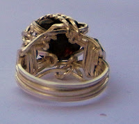
Ring number five was more of a challenge.  It was the same basic design, but I decided to use a silver core wire and twist the last two inches for an embellishment.  I just couldn't get it to lay on the ring in a pleasing manner and ended up wrapping the silver ends around the individual beads.  This would have worked out better if I had decided to wrap the twisted wire before I had to unwind my preliminary rosette design, which mottled the twisted wire effect somewhat.  The back of the ring was marred when I decided to hammer the wire wraps to enlarge the size of the ring.  I should have used my rubber mallet and not my chasing hammer.  Some of the wraps were damaged, so I learned the importance of having the right tool for the job.  At this point, I was happy to be working in practice wire!  On to rings six through ten!
Ring six was designed from the Four Bead Ring that I found at http://www.wag.on.ca/ and the artist was Alice Turner.  This is a great site for wire jewelry lessons from the no longer published Wire Jewelry Artist magazine.  I didn't actually buy this tutorial, because I started looking at the design and decided that I might just be able to figure out the wire wrap.  So this is my version and might not be exactly the same as the design in the tutorial.  It was an easy ring design and the only difficult part was deciding on when to add the beads.  I didn't wrap the back of the ring shank, so the four bands of wire are clearly visible. 

Ring seven is a variation of the simple ring design that seems to be available everywhere on the internetLytha Studios.
Ring eight is the same basic ring, but with three round faceted garnet beads and no shank wrap.
I did enjoy these simple rings a lot, as there is a lot of room for creativity and they are simple and fast to make.


For Ring nine I wanted to try something a little more challenging, so I did a lot of searching around on the internet and found a wonderful free tutorial at Wire Jewelry Bootcamp.com.  Preston Reuther is a wonderful teacher and I will probably sign up for his courses in the near future.  If his video could get me through this very intricate ring design with very few hiccups, I can hardly wait to see what the rest of his lessons are like:

And so on to Ring ten.  For this ring I decided to make a dainty piece of jewelry that my Mom might like to wear, so I selected a freshwater pearl that had tones of black, green blue, etc. and to use the simple ring design so that the spotlight is on the pearl.  It probably helped that this was the third time that I made a variation of this one design, and the result was a very pretty ring that my Mom tried on and decided was hers as soon as she saw it!


Next stop:  sterling silver rings!  I am so happy that I bought some sterling square wire this summer for some bracelet sales that didn't materialize, because now it can all turn into ring creations!

Monday, August 1, 2011

In search of opalescence


I have been on a polymer clay quest for the past month and a half now to see just what kinds of effects could be obtained using metal leaf and alcohol inks with polymer clay.  I am also experimenting with embossing powders and acrylic iridescent medium.  This has been a wild ride.  The first batch of clay reminded me a lot of ocean waves and some very interesting jewelry resulted from the beads made from the first batch of clay.  I worked in blues and greens, because I wanted to use the clay to make jewelry for my cousin and two of her daughters who all love blue.

The jewelry all came out differently and quite interesting.  I experimented with using black clay, white clay and translucent as a background just to see how many different looks I could get.  Once we got back from our trip, I still had a lot of clay left over and decided to try some more ideas.  I had been wanting to do mixed media using metal stampings and polymer clay, so I got to work on some nice big open work flowers.  I had been meaning to try a bracelet with some of these so I decided to curve the metal on a bracelet mandrel and backfill with some of the alcohol ink/silver leaf mix.  I added iridescent embossing powder and iridescent acrylic medium and liquid polymer just for fun.
Next, I decided to backfill some brass pegasus charms that I had been anxious to make into some jewelry.  This time I only added liquid polymer for a slightly less iridescent look.  The blues and greens looked great against the brass.

My next idea was to use gold clay as the background and to be a little less happy with the alcohol ink, since some of my clay came out too dark and obliterated the silver leaf.  I also switched to variegated green and gold leaf just for fun.  This time I decided to backfill some stamped brass scarab beetles that were just begging to be a charm bracelet.  I also covered the leaf and ink surface with a very thin layer of translucent polymer clay.  The end result is a little reminiscent of mosaics and I believe it goes beautifully with the scarabs.

Sunday, May 1, 2011

Pretty in Pink . . . Creating a Jewelry Ensemble Fit for Sleeping Beauty for a Little Girl's "Once Upon a Dream" Trip to Disney World

A friend of mine commissioned me to make a custom necklace and tiara for her little daughter who loves Sleeping Beauty for her birthday and an upcoming tirp to Disney World.  She will wear the jewelry and the Sleeping Beauty dress fit for a princess that she will receive as birthday gifts before the trip.  This design required a bit of planning since it was custom work but the recipient could not be consulted directly.  My friend ascertained that her little daughter was adamant that everything had to be pink including Sleeping Beauty's crown!  Since this little "Sleeping Beauty" is quite young, we decided that the "jewels" in the crown and necklace could not be glass--they would have to be pearls or stones or plastic/resin. 

I began my research.  Sleeping Beauty's jewelry in the Disney cartoon illustrations is all gold.  Since everything needed to be pink, I decided to make a custom batch of Premo to construct the focal pendant and the crown using fuchsia, neon pink, gold, translucent, and pearl colors.  I like to add translucent to all of my Premo mixes because it seems to make the Premo less crumbly, more flexible and even glass-like in some instances.  I added in the pearl clay to lighten the color and to add mica particles so that I would be able to use a mica shift technique on the surface of the crown and pendant and achieve a patterned, metallic effect in pink! 

Sleeping Beauty's necklace seems to be a pendant shaped somewhat like a diamond with either a solid metal curved band or possibly a rope or ribbon suspending it around her neck.  The pendant was made with the patterned clay and I decided to make a focal sculpted rose bead for the pendant to carry out the Briar Rose theme and then embellish it with purple fresh water pearls.  I used one of the purple resin roses that I purchased for the necklace beads and made a mold from a ball of translucent clay so that I could reproduce a similar sculpted rose for the pendant.  I mixed one part fuchsia and three parts translucent to get a more glass-like effect for the rose.  I used more of the patterned clay to make a self-bail for the pendant and then made a tiny coiled rope of pink and gold striped clay to border the pendant design.  The rose was embellished with Pearl Ex in Pink/Blue and the entire front of the pendant was brushed with crystal glittered embossing powder.
This part of the pendant was baked and then a second piece of patterned pink Premo stamped with my makers' signature was carefully adhered to the back of the pendant and smoothed seamlessly into place and then re-baked. 
The balance of the necklace was designed using a slightly different mixture of Premo originally layered with translucent and fuchsia layers along with some of the custom pink and adding silver leaf.  Four of these beads were made by rolling out a sheet on the thickest setting of the pasta machine and then constructing a tube, matching the thickness of the bail on the pendant and the size of the inner opening to make sure they could be strung on a similar thickness of material.  A metal mandrel was then inserted into the tube so that it could be sliced into four beads without collapsing the opening.  The resulting beads were smoothed, rounded somewhat, checked for problems and baked.  Purchased resin beads resembling sculpted roses and metallic pink lentils were added to the design.  I decided to string the beads onto a 12 gauge piece of "Lady Pink" aluminum wire and add a simple hook fastener that would be easy for a little girl to manipulate.
On to the princess crown!  I had to experiment a little with the crown idea.  I wanted to use the mica shift effect on the crown as well but I had to account for the structural qualities of the Premo with all of that mica added.  Metallic Premo is not as pliable as the translucent or regular colors and I couldn't have any crumbling going on.  I decided on two layers of the custom pink color, patterned with different designs and carefully shaved down to a smooth surface with a ghost image and then laid together back to back, being careful of any air bubbles.  The crown template was laid over these and the crown was carefully  cut out.  Silver grommets were added on each side so that later straps, ribbons, or elastic could be added to keep the crown in place, much like a mask or headband.  I added a matching sculpted rose to the bottom center of the crown and then created another rose/gold twisted rope and made a spiral design for the top of the crown and embellished it with purple fresh water pearls.  The crown was then coated with liquid polymer clay and the crystal embossing powder for a little added smoothness and sparkle.  I wanted a curved crown so I wrapped the crown around an empty can and that is how it was baked.  Once the crown was cool enough to handle I modified the curve by placing it against my forehead so that the final design was a slight  curve. 
I started thinking about possible safety and sturdiness issues for a young child and decided that even though the crown surface was leather-like at this point, it probably would not take a lot of abuse and should probably be stabilized with a wire frame.  I used more of the "Lady Pink" 12 gauge wire and decided to add 18 gauge coiled wire of the same color with strategically placed prongs to hold the crown in the frame. 
After trying on the crown in the mirror, it seemed that it would look better and more authentic if the crown were to sit on top of the head instead of against the forehead.  This would require combs.  I decided on plastic combs because they are lighter and less likely to break a child's fine hair.  Two plastic combs were found in the bridal section of the arts and  crafts store and they were easily wired in place onto the bottom base of the crown.
This was a fascinating creative exercise and it challenged me to find artistic solutions to structural issues.  It demanded a study of the future user of the design and that person's needs and desires.  I learned a lot about the structure of a tiara, wire wrapping, and mica shift along the way.  Now I just  can't wait to see how it is received by the little princess!

Monday, April 25, 2011

Mixed Media Explorations Rich in Color

I have done a little work in chain maille using neon colored aluminum jump rings and combining them with faux dichro and natasha polymer pendants.  I decided to do further explorations with aluminum and copper wire in neon colors in order to improve my wire jewelry skills before foraying into sterling silver, since the price of sterling silver has jumped to 2.5 times the price I was paying last spring.

My first piece started out with a polymer pendant in canework coupled with a very intricately patterned heart veneer.  The canework resulted in something reminiscent of the mola work in fabrics by the Cuna Indians in Panama.  I will explore this idea further in later explorations, because I really liked the results.  At any rate, I made a rather large focal pendant and two matching earrings using the "mola" canes and some very intricately patterned clay that resulted as a by-product of the cane work.  I had some scrap clay in a similar mauve and purple color combo from some mokume gane work done several years ago and decided to make some Pandora style beads with this veneer to include in the piece.  I also purchased some multi-colored faceted glass beads (also Pandora Style) to round out the bead selections for the necklace.  I wanted to tie the entire piece together with some fuchsia colored aluminum wire and some fuchsia and purple jump rings.  The beads were strung on the wire and then I added matching coiled wire that I spiralled around the bead groups for a playful, kinetic feel.  Each bead group was connected to the rest of the necklace with rosettes in the purple and fuchsia jump rings.  I added a matching toggle clasp to finish off the necklace.  People really seem to like this set.  It gets a lot of compliments.

Next came a necklace creation for my cousin, who loves dark pinks and magentas.  I decided to do something a little different for her, so I made a necklace chain using 16 gauge fuchsia colored wire with double undulating links ending in a bib using multiple shades of pink, mauve, magenta and purple in two styles of glass bead with purple fresh water pearls as accents.  I added some matching aluminum jump rings to the bottom row for a little added jiggle just to make it more fun.  The matching earrings used the chain links with one row repeated from the bib in a triangle shaped dangle on french earwires.

The next exploration was done with aurora borealis crystal beads in a topaz color with pink and blue lights.  I coupled the big beads with blue and pink swarovski crystals and used pale rose colored copper wire to link each of the beads together.  I made matching earwires for non-pierced ears to the set for a complete look.  Even if you have pierced ears, you might like these earwires, since the big focal beads could be rather heavy for a pierced earring.

Next came a bracelet with green copper wire bent into abstract geometric shapes accented with small green and white striped glass beads.  The wire was hammered gently with a plastic mallet to harden and stiffen the shapes and the clasp is adjustable with a spiral "eye" that gets hooked by the last wire shape on the opposite end of the bracelet.

Finally, I made a study in purple and dark red with a polymer focal pendant, all strung on purple copper wire.  This jewelry set incorporates all of the wire wrapping techniques, including wrapped wire looped bead connectors, coiled wire, wire wrapping on a pendant, a matching hook clasp in twisted purple and fuchsia wire, chain maille rosetts, and even weaving wire components through the chain maille!  It is dripping in glass beads and pearls, swimming in swarovskis, and all in all, is a stunning color-drenched art necklace with matching non-pierced earwires.

Next up, non-tarnish silver, gold and copper wire creations coming soon!